You’ve probably heard about how important it is to keep things “above the fold.” It seems simple, but a lot of people are missing the point. Let’s look at what really matters about “above the fold” and what’s just mythology.
Above the fold is an old newspaper term. It refers to the top half of the front page of the paper. That’s what sells the paper because it’s the part you can see without paying.
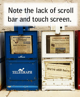
photo by Wayne Wilkinson www.flickr.com/photos/waynewilkinson/
Heck, there are probably even some other pages you could peruse for free.
So, don’t cram everything above the fold. You’ve got infinite amounts of paper and ink to work with. Use what space you need to make your point. After you’ve made your case with good, well-reasoned copy it’s time to seal the deal.
There’s a trend these days to put a big signup form or checkout button up above the fold on the home page. It’s like showing up for a first date with no pants on.
If you want to take your pants off around someone, you should take the time to convince them that it’s a good idea first.
Just like you should take the time to let your visitors learn how great of an idea it is to give you money.
Now, I mention this “fold” concept atop my own website. It is an important idea, but it must be understood properly.
The above the fold area of a website is like a headline. It’s your chance to grab the reader’s attention, to tell them they’re in the right place to solve their problem, to make them feel like reading what you have to say is a good use of their precious time.
Remember that when you’re planning out what to put at the top of a page. Use the space to flirt. Make a good first impression by dressing sharply and speaking well. By that I mean you should include:
- A compelling headline that connects with the conversation inside your prospect’s head and generates curiosity
- A picture that includes a human, preferably a human that is pleasant to look at
- Evidence that you’re trustworthy like credentials, testimonials, nice typography, polished design, proper spelling, and maybe a toll free phone number.
People know how to scroll down. There’s no need to make the sale in the top 600 pixels of your site. You just need to build enough interest and trust that they’ll want to scroll down for a second date.