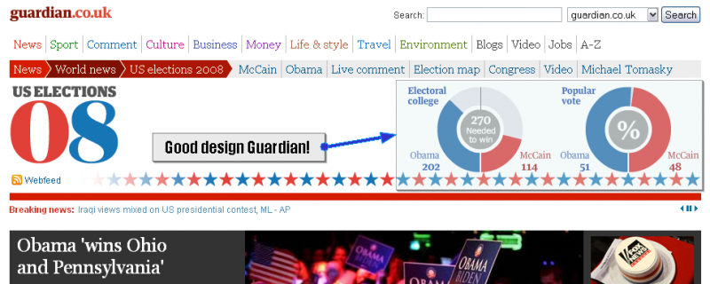
I neglected to mention last time that guardian.co.uk formats their summary graphs in a very attractive way. All the US websites seem to be a horizontal bar with the win point of 270 electoral votes marked at center. The Guardian is using circular, or arcing bar graphs for electoral votes and popular vote.
Politico is doing a good job with clear easy to navigate data. Their numbers are a little more conservative than Google, but still a bit higher than the NY Times. They cite the Associated Press as their source of data, but have deployed a great web interface to that data. There’s a scrolling list of battleground states and their latest numbers along with the traditional map. They have tabs to see different races, and a concise summary including total popular vote. Of course they have a bevy of live bloggers churning out blog entries as fast as they can.
The Huffington Post has a webpage devoted to embedded widgets from other websites. It’s a great webpage to compare the numbers that different sources are reporting. They have already declared Obama President elect, but they do tend to be a little bit biased towards the left.
On the other end of the biased media spectrum Fox News seems to be having technical difficulties with their AJAX map, but the headline declares “President Obama”
North Caroina is still too close to call at all. It’s been very exciting to live in Hillsborough, NC during this election. North Carolina has been a solid republican state in every election in my lifetime. I was born in Alamance county, NC. I’ve lived in Durham, Chapel Hill, Carrboro, and Hillsborough as well. I’ve never seen so much election activity and focus before.
